Welcome to our Project 4 page ! In this page we will summarize our observations and result after user testing evaluation.
LOW FIDELITY PROTOTYPING REPORT
INTRODUCTION

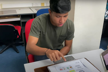
Low-fidelity prototyping is a crucial step in the design process, as it allows designers and developers to test and iterate on their ideas before committing to a final product. Our prototype is done using inexpensive and easily modifiable materials, such as paper and cardboard. A paper prototype of our product was evaluated with a small group of users in MPK6 on January 19th, 2023. A few tasks have been given to them such as assigning drones to pick fruit, fertilize plants and check fertility. This is for us to observe them navigating with the prototype to complete the task. With the participation of 4 users in the evaluation, we could get a broad range of feedback and insights to improve the design.
USER I :
EN. SHAZMI IZWAN
USER II :
EN. IQMAL AIZAT
USER III :
EN. KAMIL EIZAZ
OBSERVATION
From the user 1, we observe that they satisfied with the system but a little bit confuse because the interface we provided is missing a few buttons. He commented to our system that it is a good narration between interface but for "assign area", the interface of change area should be a popup.
Next, from user 2, the user is very satisfied with the system interface. The wireframe is good and navigate correctly and tidily. But there is also some improvement that the user suggest for us to do which is we should include sign in/up button in login page. There is also no back button in certain interface/page makes the user confuse where should they click to go back to the main menu.
Moreover, for triple bar at the top left and the menu page name, we should change the name of it to "Home" as it is make the user confuse what is the function of this bar and page. Lastly, drone status after start the task, there is no status bar/progress if the task is being progress.
Lastly, from user 3, he commented that the system is not easy and not hard because there is some interface that is easy to understand and there is some interface/page that is hard to understand which is he do not know how to report a problem to the admin as there is a button report but not for report a problem but for report from the drone doing their task.
FINDINGS
Based on the notes that we obtained during the user testings, we gathered few findings on our system whether that being an improvement that may be done or criticism from the user. The first finding is about our tracking, mapping and edit mapping interface, the user regarded that there should also be a back button so that the interfaces will be consistent throughout the whole system. This is to avoid the user from being confused and stuck while using our system. It is also said that we should add a log in button and a sign up button in the log in and sign up interfaces.
Furthermore, the names of the interfaces in our system should be improved such as menu interface changed to home interfaces, and also our report interface should be changed to dashboard interface so that we can avoid users from thinking that the report interface is the place to submit a report if a problem occurs in our system.
Moreover, as for our system looks and design, some options such as ‘Change area’ should be made into a drop down menu to improve our system’s minimalism. We are also informed that we should add more pop ups such as when the drone is deployed to alert the users that it is successful.


_edited.jpg)
_edited.jpg)
_edited.jpg)


